Whenever I see the input screen asking for any kind of input, instead of tapping on OK, I instinctively tap the underlying checkmark button which is at the bottom right of the screen, still visible from the previous screen, and my action is interpreted as "cancel", and I have to repeat.
This design is clearly confusing, and not a good UX practice: if there are OK/Cancel options, those shall be the only selectable actions, the overlay shall not go away just by clicking outside it.
This design is clearly confusing, and not a good UX practice: if there are OK/Cancel options, those shall be the only selectable actions, the overlay shall not go away just by clicking outside it.

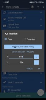
 button instead of OK. I must admit that the fact that clicking anywhere that's not the screen cancels any changes and that's pretty annoying.